Sim2Bank Mobile Wallet
Overview
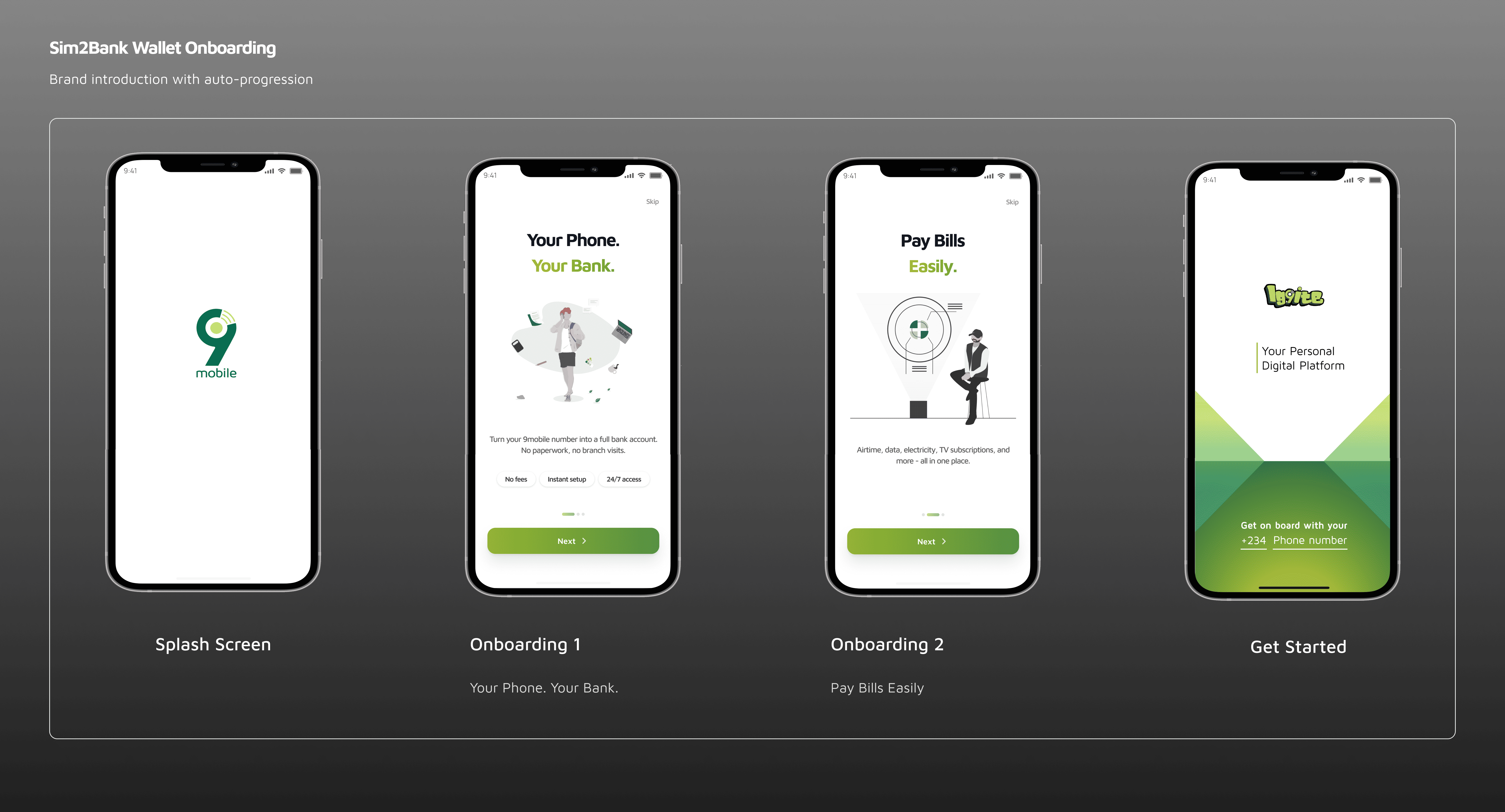
Sim2Bank is a digital wallet embedded within the 9mobile ecosystem, designed to enable users to create a wallet and perform financial transactions directly within the telecom app.
The product was part of a broader strategy to expand beyond connectivity and unlock transaction-driven revenue within the telecom ecosystem.
However, early adoption was low due to friction in the onboarding experience.
-
My RoleProduct Designer (End-to-End UX)
-
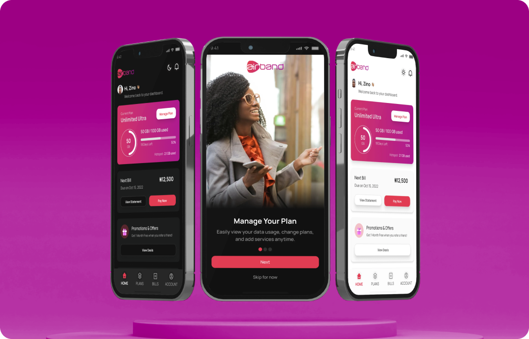
PlatformsiOS, Android
-
ScopeOnboarding, Wallet Setup, Payment UX
Impact
- +35% increase in onboarding completion rate
- –28% reduction in user drop-off during registration
- +20% faster wallet setup time
- Increased wallet adoption within the telecom app
- Improved user confidence during financial onboarding
Business Context
For 9mobile, the wallet was not just a feature—it was a strategic move into financial services.
Success depended on:
- Increasing wallet adoption
- Enabling transaction volume growth
- Building user trust in a non-traditional financial platform
However, onboarding friction was directly limiting:
- User activation
- Transaction revenue potential
The Problem
The initial onboarding experience created significant friction, causing users to abandon the process before completing wallet setup.
Key issues included:
- 7-step onboarding flow with high cognitive load
- No visibility into progress or completion time
- Unclear verification feedback during critical steps
- Low user confidence in financial registration
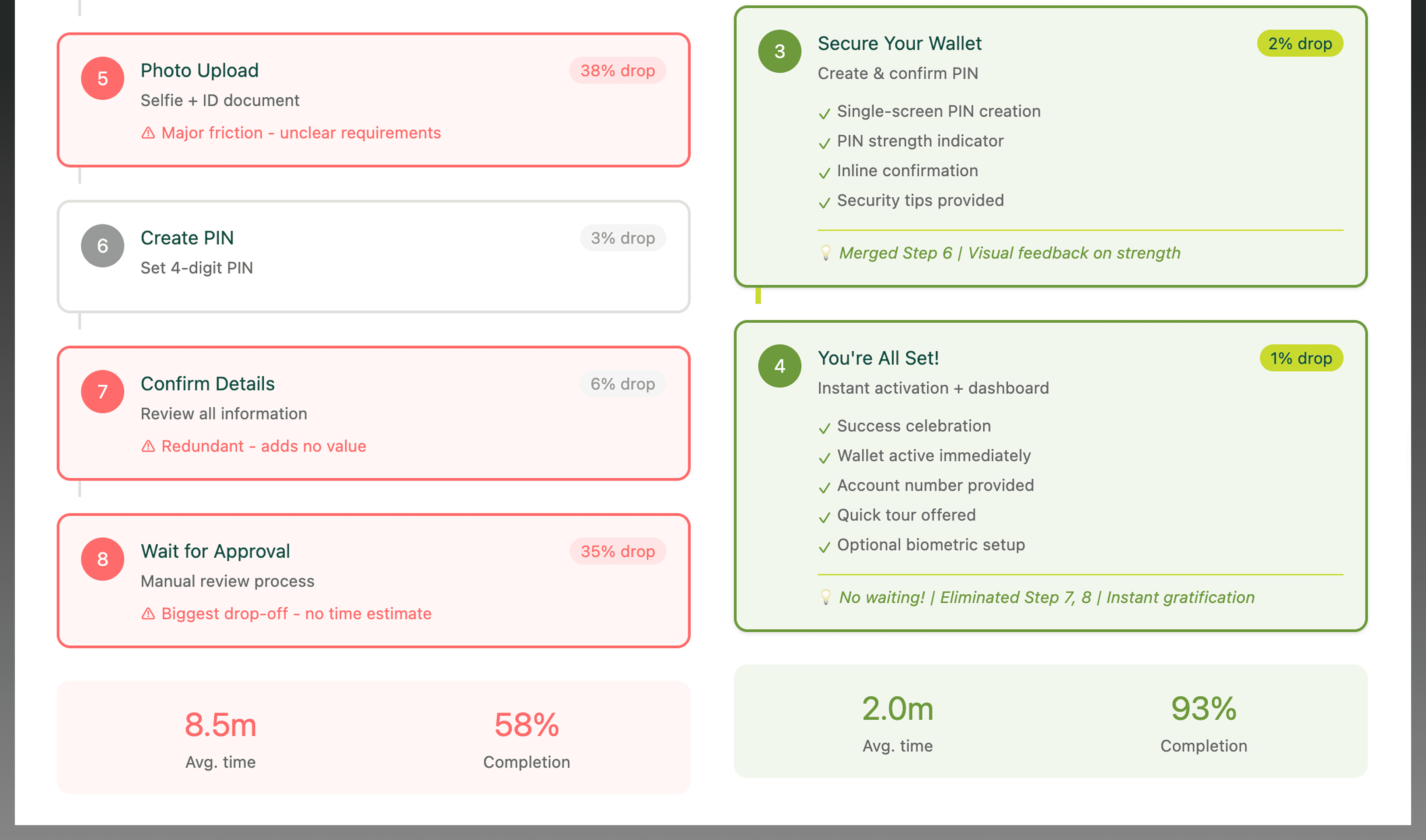
Drop-off rates increased sharply after step 4, indicating verification fatigue and uncertainty.
Evidence: Where Users Dropped Off
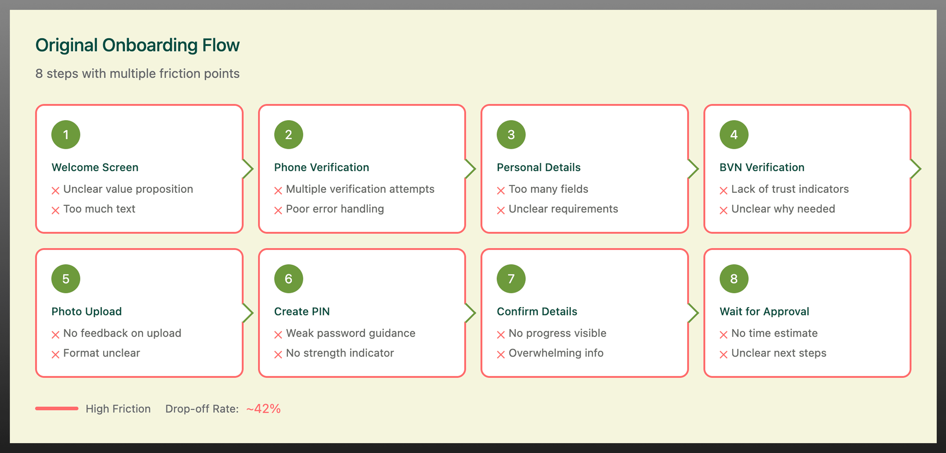
Users dropped off mid-way through onboarding due to unclear progress and excessive verification steps, particularly after step 4.
Key Insight
Users will complete financial onboarding only when the experience is:
- Predictable (clear progress)
- Fast (minimal steps)
- Trustworthy (clear feedback)
The biggest barrier was not complexity alone-it was uncertainty during critical financial actions.

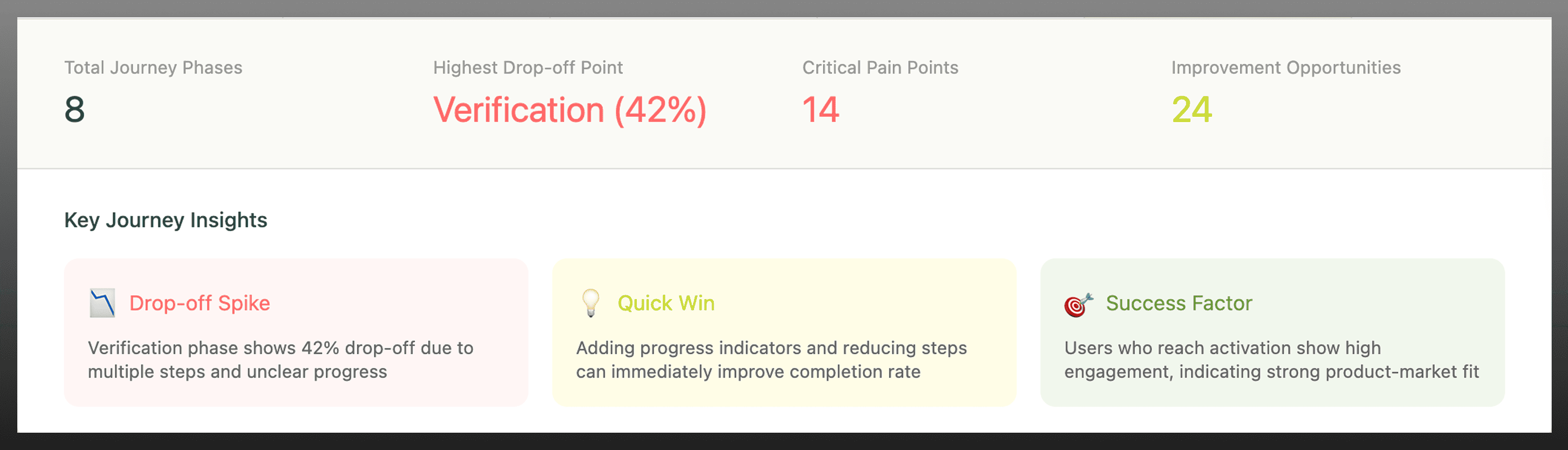
User journey mapping helped identify friction points during wallet verification and highlighted where users were most likely to abandon the onboarding process.
Product Strategy
The strategy focused on improving activation by reducing friction while preserving compliance and trust.
Design Principles
- Reduce perceived effort during onboarding
- Make system status visible at all times
- Reinforce trust during financial interactions
- Balance usability with KYC/compliance requirements
Key Product Decisions
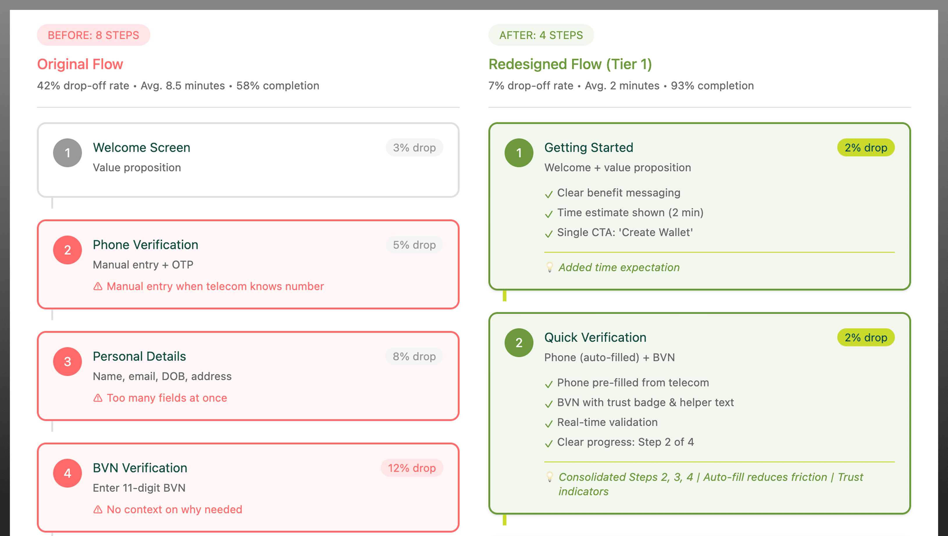
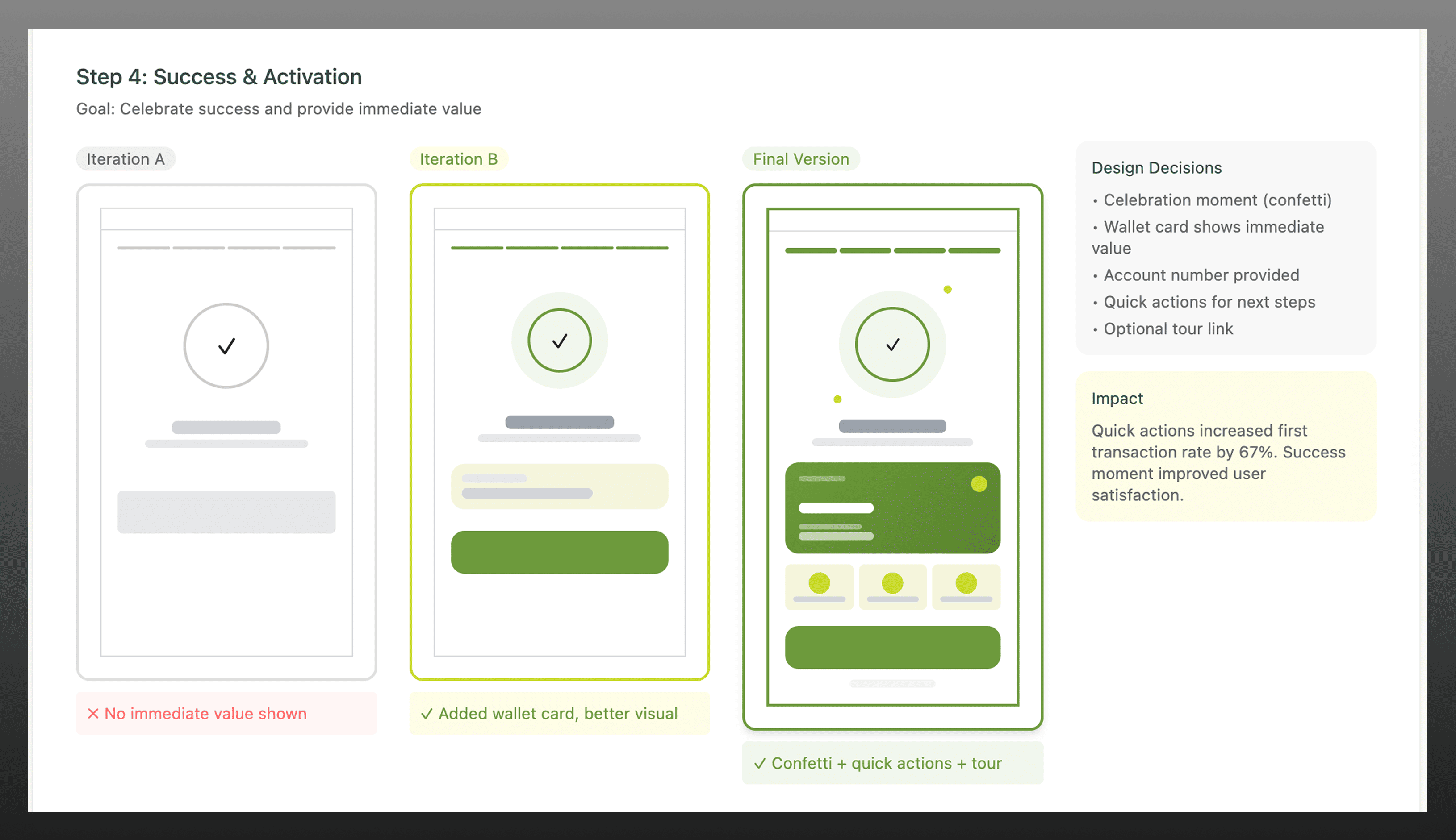
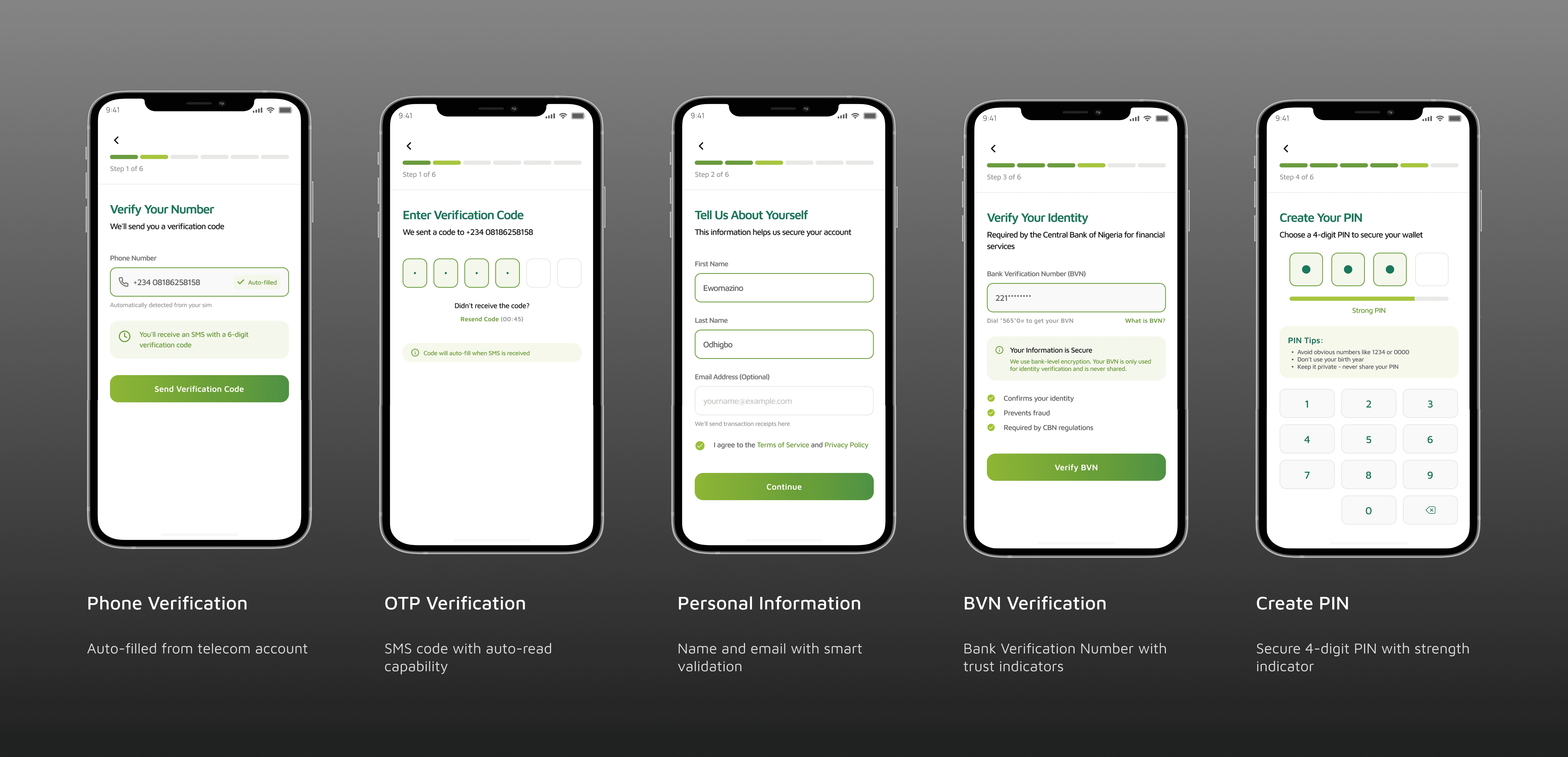
1. Reduced onboarding from 7 → 4 steps
- Why: Users abandoned onboarding after step 4 due to fatigue and uncertainty.
- Impact: Increased completion rates by making the process feel faster and more achievable.
2. Introduced progress indicators
- Why: Users needed clarity on how long onboarding would take.
- Impact: Reduced anxiety and improved task completion.
3. Simplified verification flow
- Why: Redundant inputs increased friction and slowed onboarding.
- Impact: Faster completion and reduced cognitive load.
4. Added real-time system feedback
- Why: Lack of feedback reduced trust in financial actions.
- Impact: Improved user confidence during wallet setup.
Trade-Offs & Constraints
Designing within a fintech-telecom environment required balancing usability with regulatory and technical constraints.
- Reducing steps had to retain mandatory KYC requirements
- Simplifying flows required alignment with backend verification systems
- Faster onboarding needed to maintain security and compliance standards
This meant optimisation-not removal-of critical verification steps.
Information Architecture Redesign
The onboarding architecture was restructured to reduce unnecessary steps while maintaining required verification processes.
Design Exploration
Multiple onboarding flows were explored through low-fidelity prototypes to test:
- Step reduction strategies
- Progress visibility patterns
- Verification feedback models
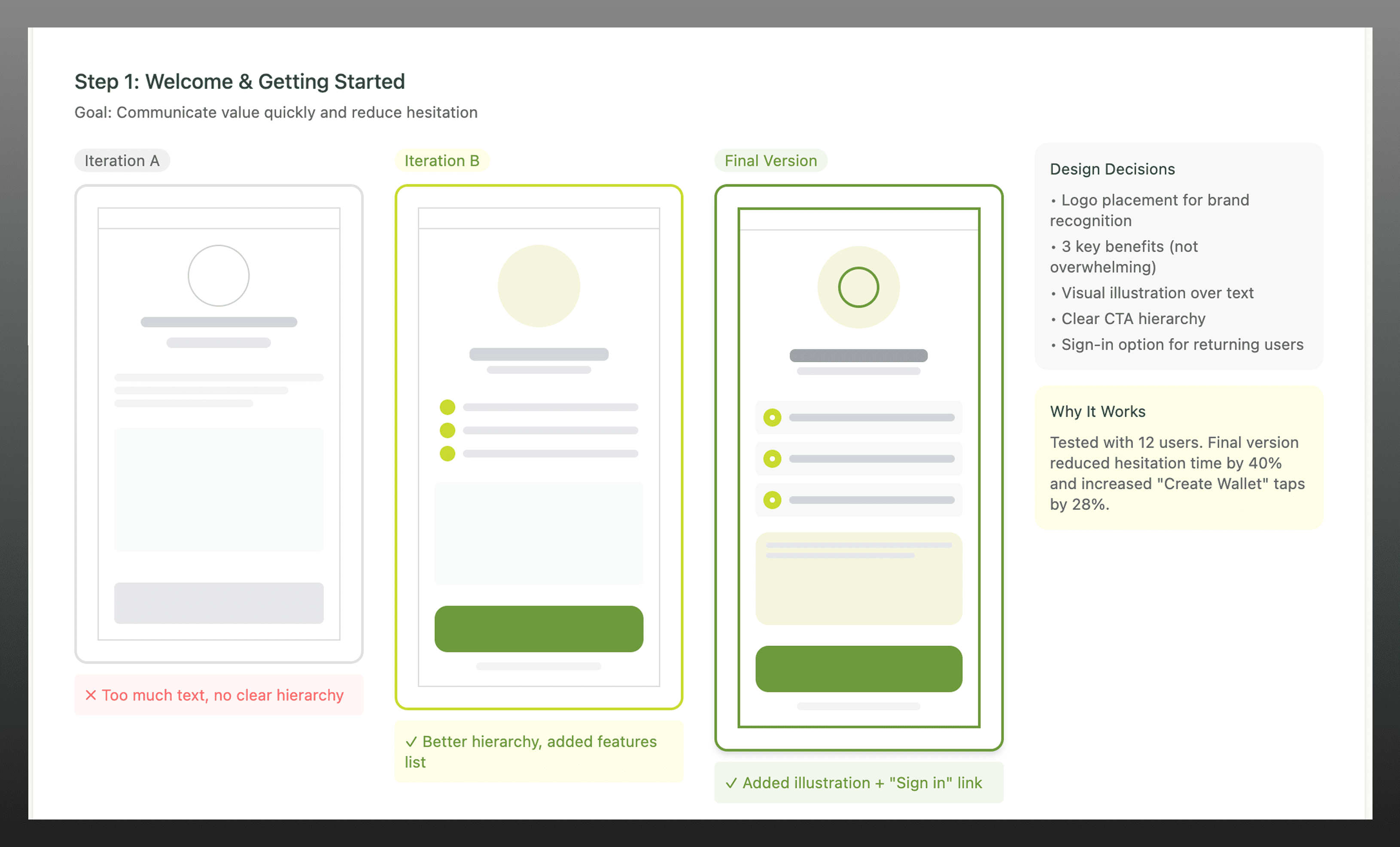
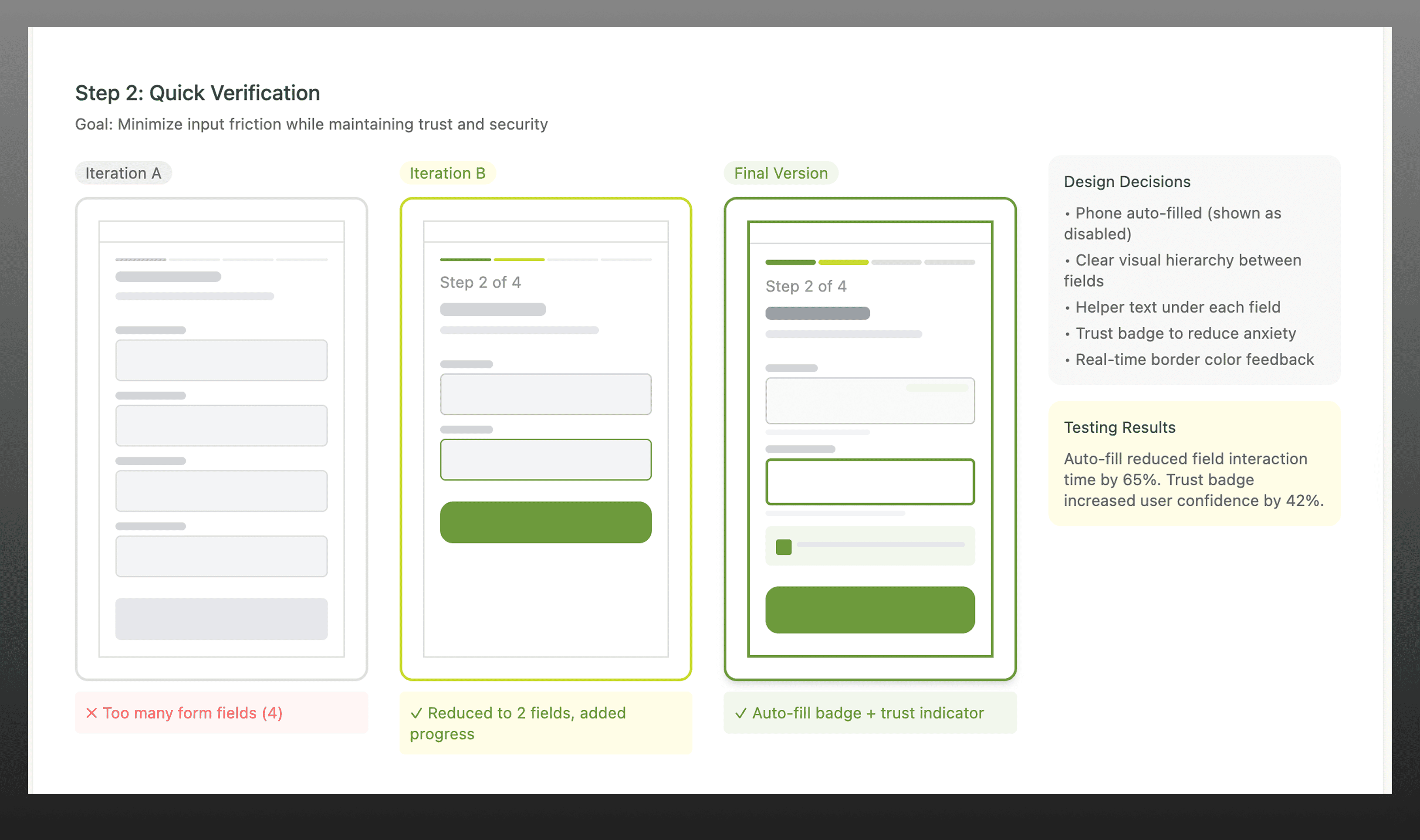
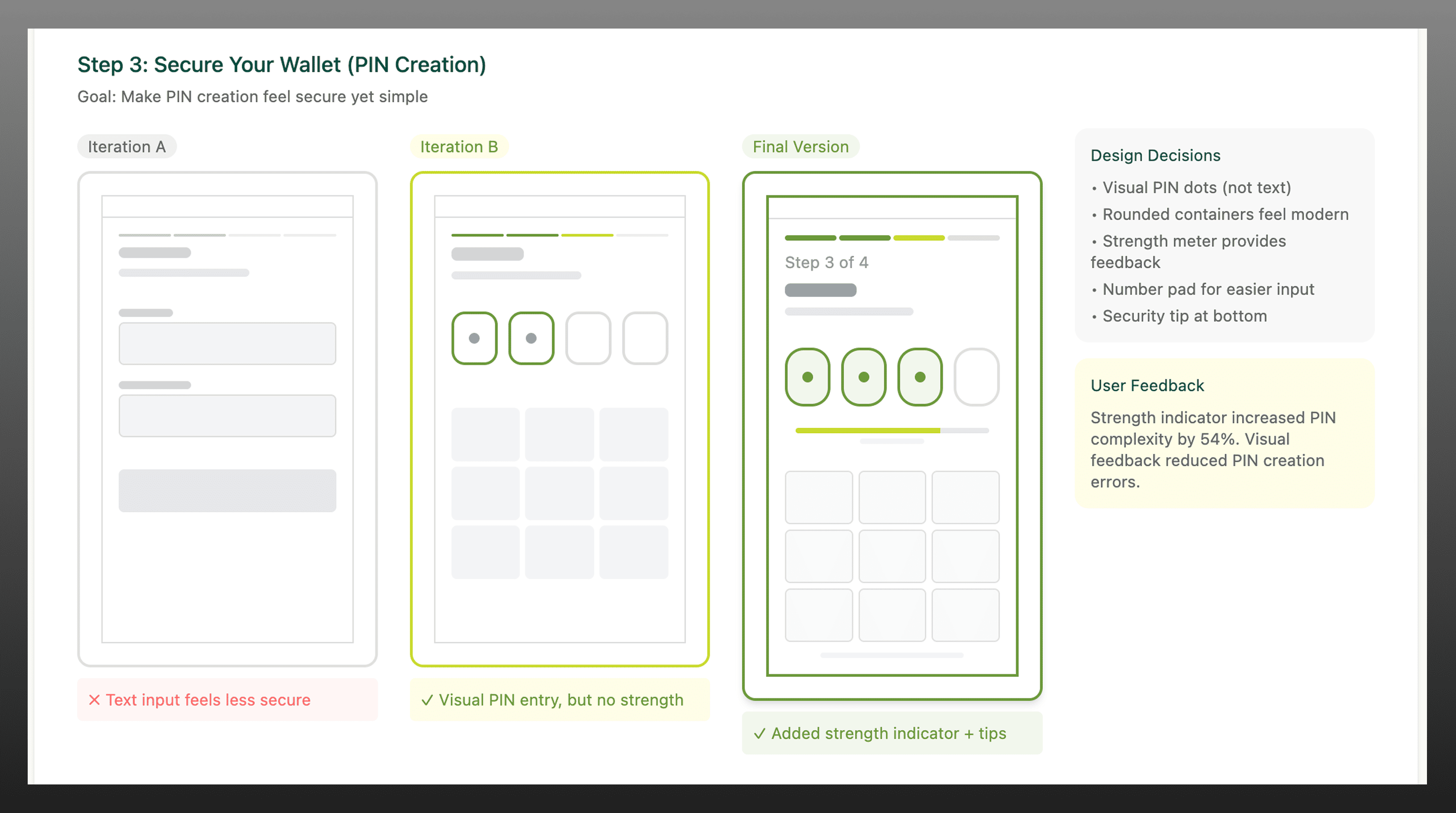
Early explorations focused on reducing onboarding complexity while maintaining clarity and compliance before moving to high-fidelity designs.
Final Solution
The final onboarding experience delivered a faster, clearer, and more trustworthy wallet setup flow.
Key improvements included:
- Streamlined 4-step onboarding flow
- Visible progress indicators
- Clear, real-time feedback
- Simplified interaction patterns
- Biometric authentication
- Progressive KYC (Tier system)
- Real-time validation
- Auto-fill capabilities
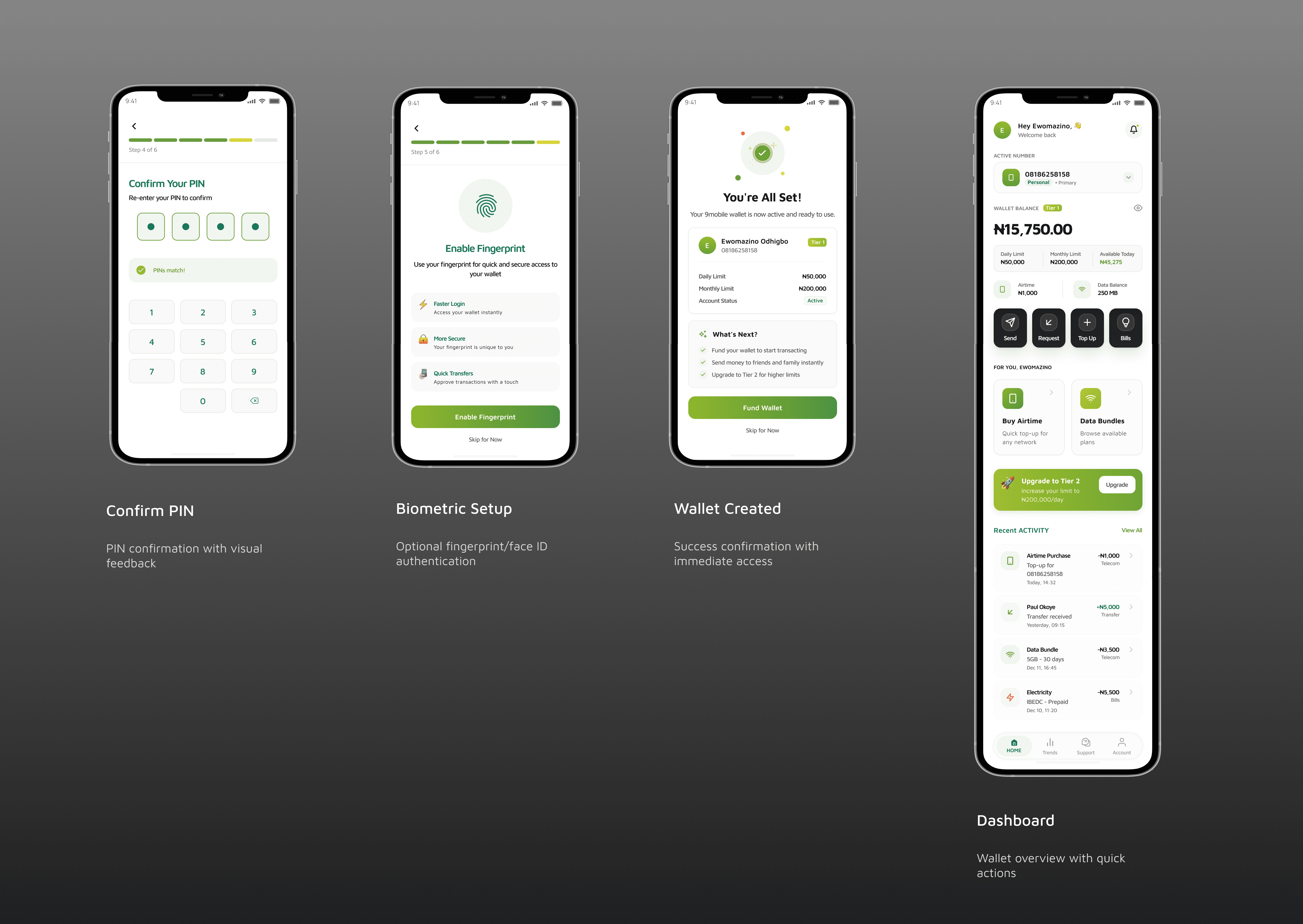
The final experience reduced friction and increased clarity, enabling users to complete onboarding with confidence.
Outcome
The redesigned onboarding flow significantly improved both user experience and product performance.
- Onboarding completion increased by 35%
- Drop-offs reduced by 28%
- Wallet setup time improved by 20%
More importantly, this directly improved activation rates, increasing the number of users entering the payment ecosystem and supporting long-term transaction growth.
This positioned the wallet as a viable financial product within the telecom ecosystem.
Key Learnings
- Designing financial products within non-financial platforms requires building trust as early as possible.
- Reducing friction is not just about removing steps, it’s about removing uncertainty.
- Balancing usability with compliance is critical in fintech, where simplifying experiences must not compromise security.