
-
RoleSenior Product Designer
-
ScopeEnd-to-end product design (mobile + web)
-
PlatformConsumer telecom + fintech ecosystem
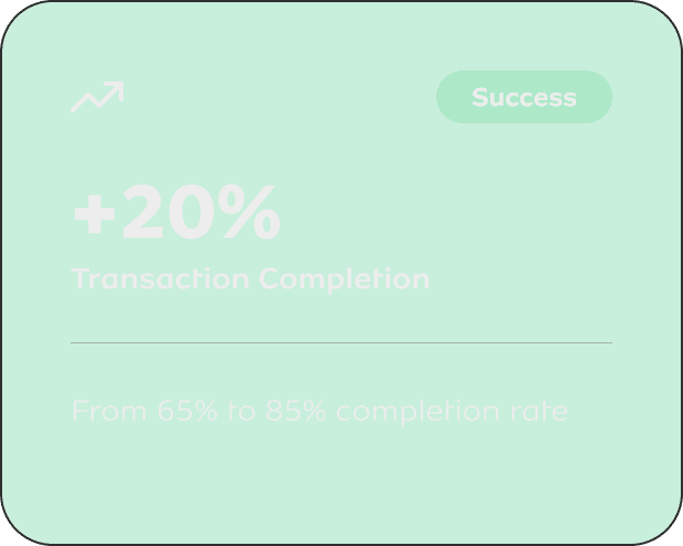
Impact
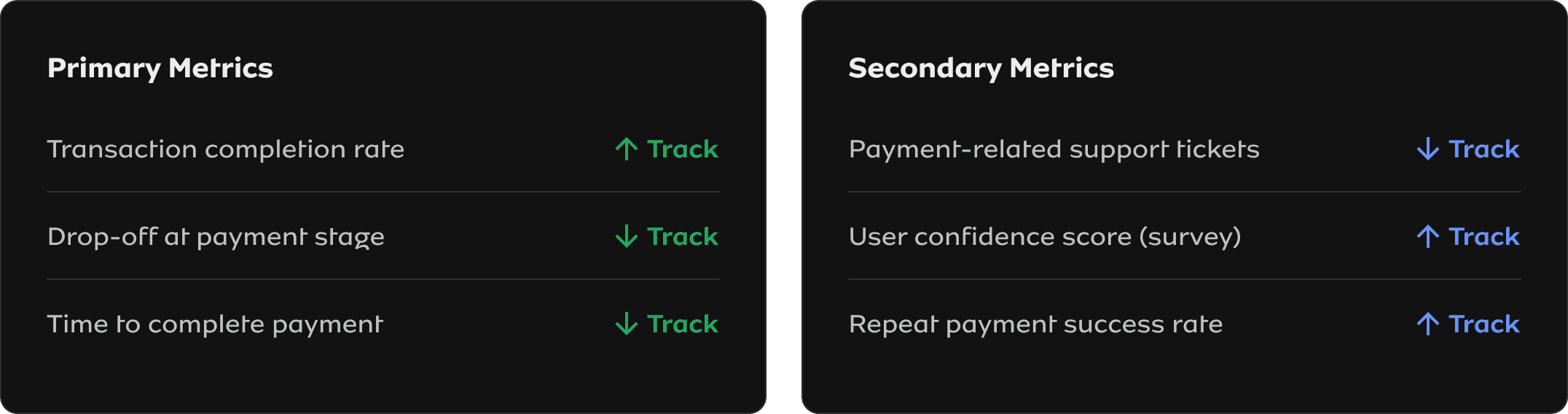
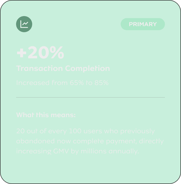
- +20% transaction completion
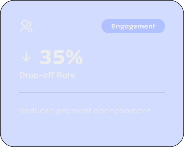
- Reduced drop-offs
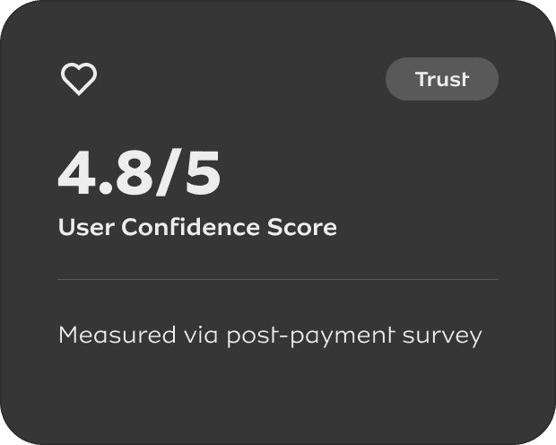
- Improved trust
01 — CONTEXT
The Business Reality
MTN operates as a digital financial ecosystem, not just a telecom product. The payment widget is embedded across merchant sites, processing millions of transactions monthly. It's a revenue-critical touchpoint where experience directly impacts conversion.
Business Problem
Payment failures were bleeding revenue and eroding merchant trust.
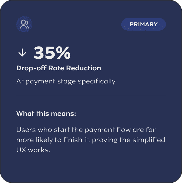
- 35% drop-off at payment stage
- Failed transactions impacting revenue
- Rising support costs
Users abandoned mid-flow, costing millions in lost GMV
Unclear error states led to repeated failures
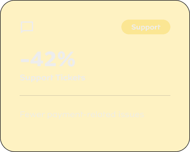
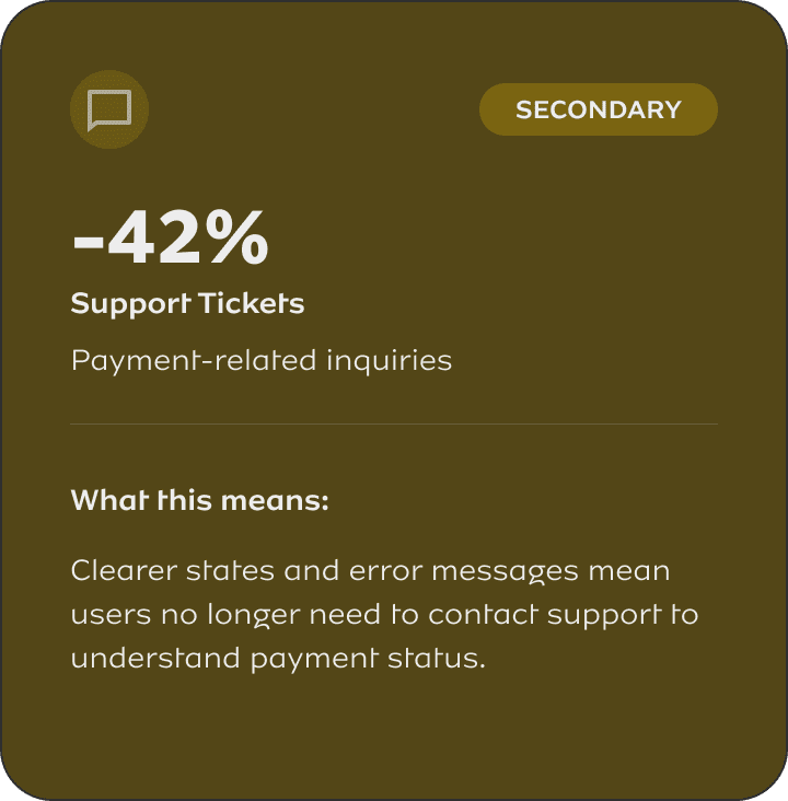
Payment-related tickets up 60% quarter-over-quarter
User Problem
People weren't failing payments, they were abandoning uncertainty.
- Zero visibility into payment status
- Cognitive overload during checkout
- Low trust in the system
"Did it work? Should I try again?"
Too many steps, unclear progression
No security signals, no error recovery guidance
In fintech, trust + clarity are not "nice to haves", they're revenue drivers. Every unclear state, every extra step, every missing feedback signal directly translates to abandoned payments and lost business.

02 - MY ROLE & OWNERSHIP
End-to-End Design
I owned the payment experience end-to-end, including:
- Product discovery
- UX strategy
- Interaction design
- UI execution
- Design system contribution
- Developer handoff + QA
I worked directly with:
- Product Managers (prioritisation, trade-offs)
- Engineers (technical feasibility)
- Business stakeholders (revenue + success metrics)
I had final say on UX direction, not just execution. This included trade-off decisions between business goals and user needs, feature prioritisation, and design system patterns.
03 - STRATEGIC APPROACH
Discovery → Strategy → Execution
Discovery & Research
Quantitative Analysis
- Analysed 2.3M payment transactions over 3 months
- Identified drop-off concentrated at steps 3 & 5
- Failed payments: 18% had unclear error messages
- Average completion time: 2m 47s (industry avg: 1m 30s)
Qualitative Insights
- 12 user interviews with recent payment failures
- Common theme: "I didn't know if it worked or failed"
- Trust concern: "Where's my money if it failed?"
- Support ticket analysis: 78% asked about payment status
Key Insights That Shaped Design
1. Users don't fail payments, they abandon uncertainty
When users can't tell if a payment is processing, pending, or failed, they close the window and try elsewhere. The problem wasn't technical failure — it was feedback failure.
2. Every extra step = perceived risk
In fintech UX, users equate complexity with unreliability. A 6-step flow signals "something could go wrong" while a 4-step flow signals "this is streamlined and safe."
3. Speed = perceived reliability
Faster doesn't just mean better UX in payments, it signals that the system works. A 45-second flow outperforms a 2-minute flow even if both succeed.
Design Strategy: 3 Core Pillars
Reduce Cognitive Load
Simplify the flow, remove unnecessary decisions, group related actions
Increase Trust Signals
Explicit payment states, security indicators, clear feedback at every step
Optimize for Speed
Faster flows, fewer interruptions, predictive defaults
Defining Success (Before Building Anything)
04 - KEY DESIGN DECISIONS
Trade-Offs & Decision-Making
Every design decision involved trade-offs. Here's how I navigated them and what I chose to prioritize.
-
BEFORE
1. Login/Authentication (multi-step)
2. Select Payment Method (scattered options)
3. Enter Payment Details
4. Verify Information (separate screen)
5. Security Confirmation (OTP)
6. Complete Payment
AFTER
1. View Transaction Summary (amount + merchant)
2. Choose Payment Option (single dropdown)
3. Enter Card Details (grouped fields)
4. Confirm Payment (one-tap)
⚠ TRADE-OFF: What We Lost
- Less flexibility in payment method selection
- Removed upfront verification step
- Combined authentication with first action
✓ TRADE-OFF: What We Gained
- 45% faster completion time
- Lower perceived complexity
- Reduced abandonment at each step
Why this trade-off was worth it: Data showed 80% of users used the same payment method. Optimizing for the majority case while keeping other options accessible (but not prominent) maximized conversion without significantly hurting flexibility.
-
THE STATES
⏳
Pending
⚙️
Processing
✓
Success
✕
Failed
⚠ TRADE-OFF: What We Lost
- Increased UI complexity (4 states vs 1 generic)
- More design & engineering effort
- Additional edge cases to handle
✓ TRADE-OFF: What We Gained
- 78% reduction in "payment status" support tickets
- Users know exactly what's happening
- Clear next actions in failure cases
Why this trade-off was worth it: The old system showed a generic spinner for everything. Users couldn't distinguish between "initializing" and "bank is processing" and "waiting for confirmation." This caused anxiety and premature abandonment. The investment in explicit states paid off immediately in reduced support load and increased trust.
-
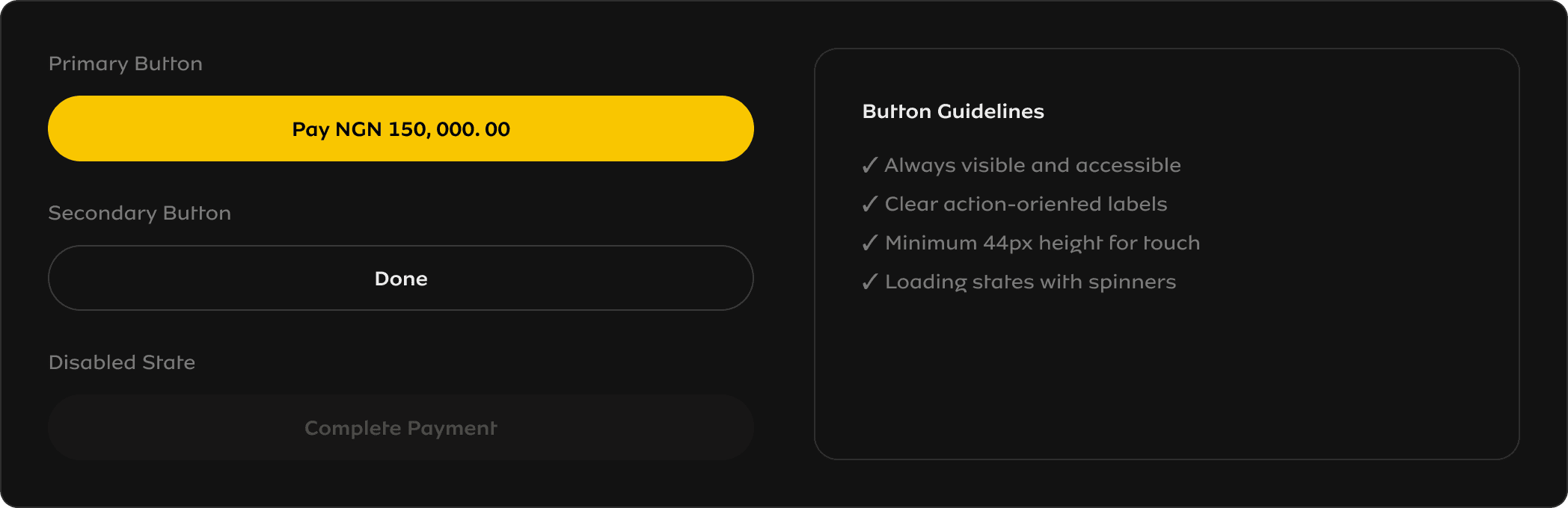
DESIGN PRINCIPLES
Primary action always in view
Button remains fixed at bottom, always accessible
Single visual hierarchy
Only one primary action per screen - no competing CTAs
Progressive disclosure
Advanced options hidden by default, accessible if needed
⚠ TRADE-OFF: What We Lost
- Less feature visibility (e.g., save card, payment history)
- Fewer upsell opportunities in the flow
- Some users may miss optional features
✓ TRADE-OFF: What We Gained
- 28% increase in CTA click-through
- Lower cognitive load = faster decisions
- Reduced decision paralysis
Why this trade-off was worth it: In payments, completion trumps discovery. We measured feature adoption and found that surfacing all options upfront actually reduced usage of those features — users were overwhelmed and skipped them. By hiding optional features behind progressive disclosure, we increased both payment completion AND feature adoption.
05 - THE SOLUTION
Final Design & Experience
A reimagined payment widget built on three pillars: simplified flow, explicit states, and action-focused UI. Below is the visual evidence of how each decision came to life.
The following sections show the actual UI I designed, with annotations explaining the reasoning behind each element.
												→ Payment Flow comparison
												→ All 4 payment states
												→ Design system components
EVIDENCE 1 — SIMPLIFIED FLOW
Payment Flow: Before vs After
Visual evidence of how I reduced steps from 6 to 4, creating a linear, guided experience
-
Login/Authentication
Multiple verification stepsSelect Payment Method
Too many options, unclear hierarchyEnter Payment Details
Scattered form fieldsVerify Information
Separate review screenSecurity Confirmation
OTP or additional verificationComplete Payment
Uncertain outcome
❌ High drop-off rate
Users abandon due to cognitive overload
-
View Transaction Summary
Clear amount & merchant infoChoose Payment Option
Single dropdown, clear hierarchyEnter Card Details (Once)
Grouped fields, encrypted messageConfirm Payment
One-tap action with clear CTA
✓ +20% transaction completion
Fewer steps = less friction = higher conversion
✓ Trust signals visible throughout
EVIDENCE 2 — PAYMENT STATES
All Four Payment States
Why Explicit States Matter
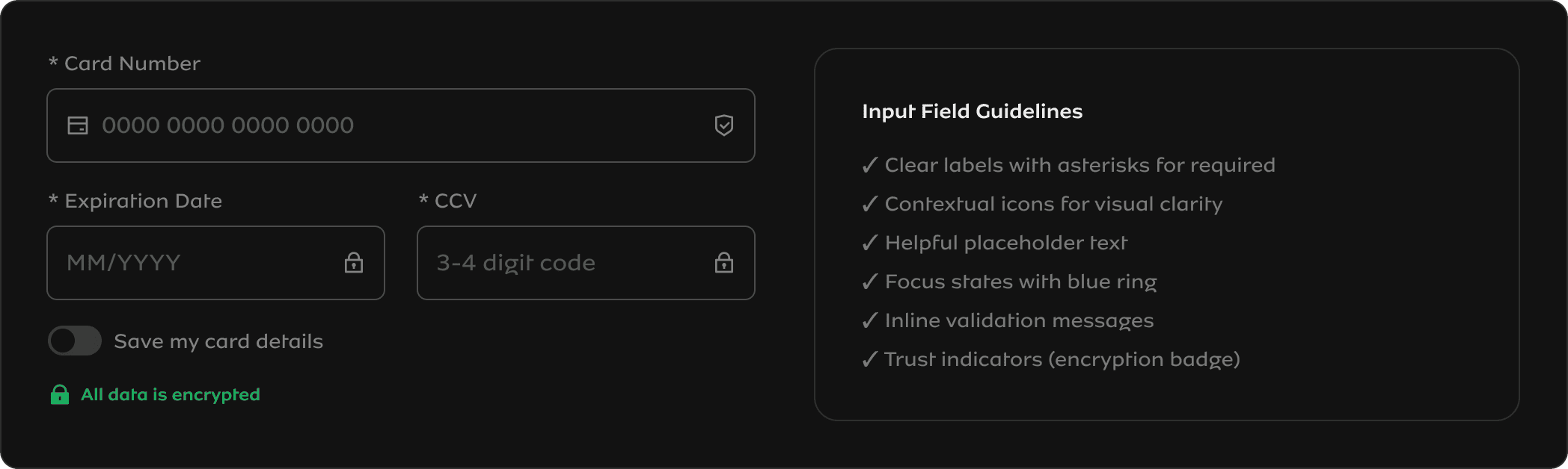
EVIDENCE 3 — DESIGN SYSTEM
UI System & Components
Scalable design system ensuring consistency across the payment experience
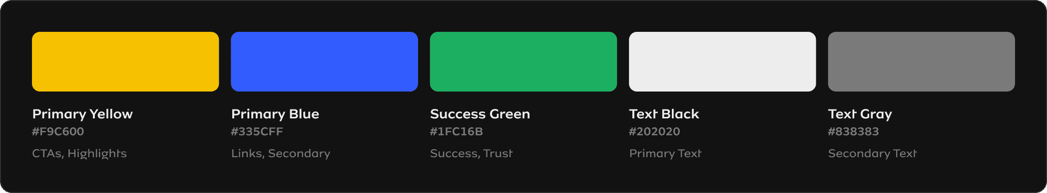
Color System
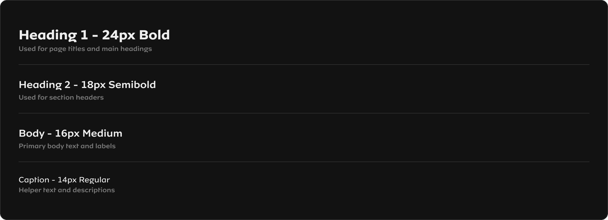
Typography Scale
Button Components
Form Input Components
EVIDENCE 4 — IMPACT METRICS
Measured Impact Visualization
Quantified results showing the business value of design decisions
06 — OUTCOMES & IMPACT
Measured Business Results
The redesign launched in a phased rollout over 6 weeks. Here's what happened.
07 — REFLECTION
Key Takeaways
What Worked Well
✓ Data-driven decision makingAnalyzing 2.3M transactions gave us confidence to make bold simplifications. The metrics validated our assumptions.
✓ Phased rollout strategy
Catching the mobile keyboard bug at 10% traffic saved us from a major incident. Always de-risk payments.
✓ Clear success metrics upfront
Defining what "good" looks like before designing prevented scope creep and kept us focused on outcomes.
What I'd Do Differently
→ Earlier engineering involvementWe discovered technical constraints around payment state webhooks late. Should have prototyped with eng in week 1.
→ More merchant stakeholder input
We focused heavily on end-users but could have gathered more feedback from merchants who embed the widget.
→ Accessibility audit earlier
We caught and fixed keyboard navigation issues in QA. Should have been part of the design phase, not validation.
Core Insight
Designing payments isn't about making beautiful UI; it's about reducing uncertainty, building trust, and enabling fast decisions under pressure.
Every pixel, every word, every transition exists to answer one question: "Is my money safe, and did this work?" When you optimize for that, conversion follows naturally.
Simplified Payment Flow
Reduced from 6 fragmented steps to 4 linear, focused actions